Matplotlib basics#
This tutorial covers some basic usage patterns and best practices to help you get started with Matplotlib. It is almost completely adapted from probably one of the most beautiful pieces of documentation out there, that is the Quick start guide of Matplotlib.
Let us first import matplotlib.pyplot with its usual alias plt, along with numpy, which will come in handy:
import matplotlib.pyplot as plt
import numpy as np
A simple example#
Matplotlib graphs your data on Figures (e.g., windows, Jupyter
widgets, etc.), each of which can contain one or more Axes, an
area where points can be specified in terms of x-y coordinates. The simplest way of
creating a Figure with an Axes is using plt.subplots().
fig, ax = plt.subplots()             # Create a figure containing a single Axes.
ax.plot([1, 2, 3, 4], [1, 4, 2, 3]); # Plot some data on the Axes.
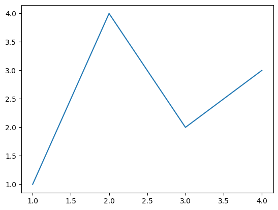
When outside of an interactive environment such as Jupyter, you’ll need to call fig.show() to see the figure.
Parts of a Figure#
Here are the components of a Matplotlib Figure.
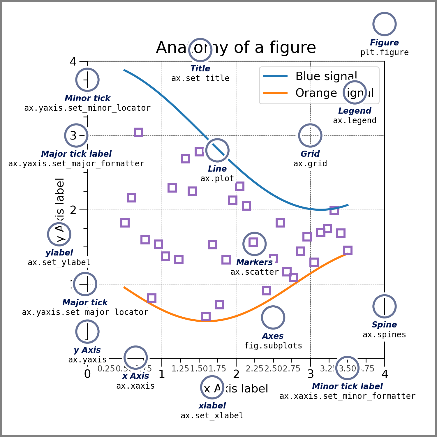
Figure#
The whole figure. The Figure keeps
track of all the child Axes, a group of
‘special’ Artists (titles, figure legends, colorbars, etc.), and
even nested subfigures.
Typically, you’ll create a new Figure through one of the following functions
fig = plt.figure()             # an empty figure with no Axes
fig, ax = plt.subplots()       # a figure with a single Axes
fig, axs = plt.subplots(2, 2)  # a figure with a 2x2 grid of Axes
# a figure with one Axes on the left, and two on the right:
fig, axs = plt.subplot_mosaic([['left', 'right_top'],
                                ['left', 'right_bottom']])
plt.subplots() and plt.subplot_mosaic() are convenience functions
that additionally create Axes objects inside the Figure, but you can also
manually add Axes later on.
All of these functions accept a figsize argument, that specifies in a tuple the (width, height) of the figure.
Figures may be saved using fig.savefig(). For instance, to save the previous figure, you can run:
fig.savefig("figure.pdf")
Common save formats are .png, .jpg or .pdf.
Axes#
An Axes is an Artist attached to a Figure that contains a region for
plotting data, and usually includes two (or three in the case of 3D)
Axis objects (be aware of the difference
between Axes and Axis) that provide ticks and tick labels to
provide scales for the data in the Axes. Each Axes also
has a title
(set via Axes.set_title()), an x-label (set via
Axes.set_xlabel()), and a y-label (set via
Axes.set_ylabel()).
The Axes methods are the primary interface for configuring
most parts of your plot (adding data, controlling axis scales and
limits, adding labels etc.).
Axis#
These objects set the scale and limits and generate ticks (the marks
on the Axis) and ticklabels (strings labeling the ticks). The location
of the ticks is determined by a matplotlib.ticker.Locator object and the
ticklabel strings are formatted by a matplotlib.ticker.Formatter. The
combination of the correct .Locator and .Formatter gives very fine
control over the tick locations and labels.
Artist#
Basically, everything visible on the Figure is an Artist (even
Figure, Axes, and Axis objects). This includes
Text objects, Line2D objects, collections objects, Patch
objects, etc. When the Figure is rendered, all of the
Artists are drawn to the canvas. Most Artists are tied to an Axes; such
an Artist cannot be shared by multiple Axes, or moved from one to another.
A note on coding style#
This guide will only present the explicit (or “object-oriented”) way to create Figures and Axes. Why? First, because this will allow you to properly understand what we do here, like where we’re actually drawing stuff. Second, this will enable you to make more complex plots in the future, which is sometimes simply not possible when you go down the implicit way.
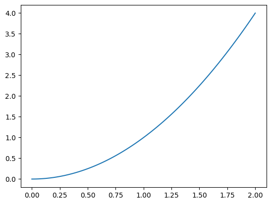
Types of inputs to plotting functions#
Plotting functions expect an np.array as
input, or objects that can be converted to an array (via np.asarray()), like lists, for instance.
So for instance, to draw the function x**2 over the interval [0, 2], you can simply write:
x = np.linspace(0, 2, 100)

fig, ax = plt.subplots()
ax.plot(x, x**2);
Most methods will also parse a string-indexable object like a dict, or a polars.DataFrame. Matplotlib allows you to provide the data keyword argument and generate plots passing the strings corresponding to the x and y variables.
We can thus reproduce the plot shown above using a dictionary as input:
data = {'x': x, 'x_squared': x ** 2}

fig, ax = plt.subplots()
ax.plot('x', 'x_squared', data=data);
Plot types#
Matplotlib allows you to generate plots of many different kinds. Here we’ll show just two additional ones, as they can be very useful.
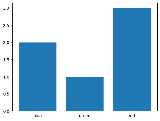
Bar chart#
You can make a bar plot using Axes.bar(), to show for instance the number of occurrences of elements in an array. To get the latter, we use the np.unique() function, passing return_counts=True to get the frequency count of unique values in a NumPy array.
colors = np.array(["red", "green", "blue", "red", "red", "blue"])
unique_colors, count = np.unique(colors, return_counts=True)

fig, ax = plt.subplots()
ax.bar(unique_colors, count);
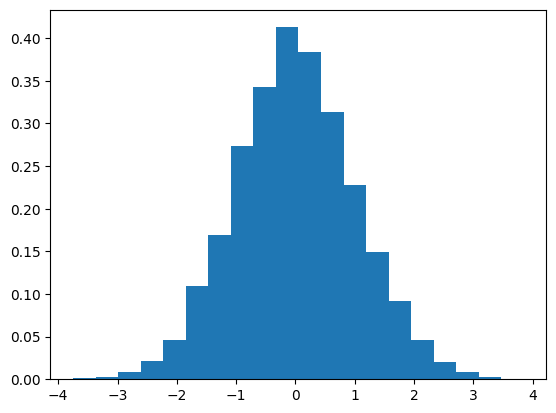
Distributions#
To quickly plot a distribution, you can use Axes.hist(), it will bin your data and compute the height of each bin, giving you some control over the binning with parameters such as bin, for you to pass the number of bins, and density, to normalise the frequencies:
data = np.random.randn(10000)

fig, ax = plt.subplots()
counts, bin_edges, bar = ax.hist(data, bins=20, density=True)
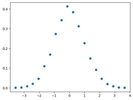
To have more control, or simply plot the distribution in a different form than with bars, you may perform these preliminary computations yourself using np.histogram():
counts, bin_edges = np.histogram(data, bins=20, density=True)

fig, ax = plt.subplots()
ax.scatter((bin_edges[1:] + bin_edges[:-1]) / 2, counts);
Labelling plots#
Axes labels and text#
Axes.set_xlabel(), Axes.set_ylabel(), and Axes.set_title() are used to
add text in the indicated locations. Text can also be directly added to plots using
Axes.text():
fig, ax = plt.subplots(figsize=(5, 2.7), layout='constrained')
# the histogram of the data
n, bins, patches = ax.hist(data, 50, density=True)

ax.set_xlabel('x')
ax.set_ylabel('Probability')
ax.set_title('Some title\n(on two lines)')
ax.text(-3, .35, "Hey there");
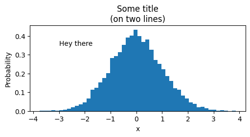
Important
Any figure you present to someone else should feature axis labels!
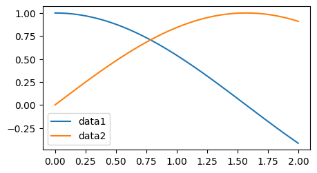
Legends#
Often we want to identify lines or markers with a Axes.legend():
x = np.linspace(0, 2, 100)

fig, ax = plt.subplots(figsize=(5, 2.7))
ax.plot(x, np.cos(x), label='data1')
ax.plot(x, np.sin(x), label='data2')
ax.legend();
See also
Legends in Matplotlib are quite flexible in layout, placement, and what Artists they can represent. They are discussed in detail in the legend guide.
Annotations#
We can also annotate points on a plot, often by connecting an arrow pointing
to xy, to a piece of text at xytext:
fig, ax = plt.subplots(figsize=(5, 2.7))

t = np.arange(0.0, 5.0, 0.01)
s = np.cos(2 * np.pi * t)
line, = ax.plot(t, s)

ax.annotate('local max', xy=(2, 1), xytext=(3, 1.5),
            arrowprops=dict(facecolor='black', shrink=0.05))

ax.set_ylim(-2, 2)
(-2.0, 2.0)
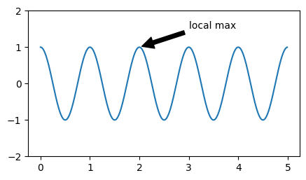
In this basic example, both xy and xytext are in data coordinates.
See also
There are a variety of other coordinate systems one can choose – see the annotations tutorial.
Using mathematical expressions in text#
Matplotlib accepts TeX equation expressions in any text expression. For example to write the expression \(\int_{0}^{\infty } x^2 dx\), you can write a TeX expression surrounded by dollar signs:
fig, ax = plt.subplots(figsize=(2, 2))
text = r"Equation: $\int_{0}^{\infty } x^2 dx$"
ax.text(0.1, 0.75, text)
ax.text(0.1, 0.25, text, math_fontfamily='cm');
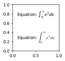
where the r preceding the title string signifies that the string is a
raw string.
Thus, it won’t treat the backslashes \, which are common in LaTeX, as Python escapes.
Also note the use of the math_fontfamily argument, which allows you to set the font for maths expressions separately.
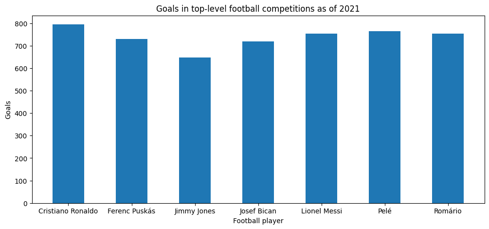
Exercise - goleadors#
✪✪ Display a bar plot of football players and their total goals in top-level football competitions (as of 2021), with their names sorted alphabetically
REMEMBER title and axis labels, make sure all texts are clearly visible
players = {
    "Cristiano Ronaldo": 795,
    "Pelé": 765,
    "Lionel Messi": 755,
    "Romário": 753,
    "Ferenc Puskás": 729,
    "Josef Bican": 720,
    "Jimmy Jones": 647,
}
Show code cell source
fig, ax = plt.subplots(figsize=(12, 5))

xs = sorted(players.keys())
ys = [players[n] for n in xs]

ax.bar(xs, ys, 0.5, align="center")
ax.set_title("Goals in top-level football competitions as of 2021")
ax.set_xlabel("Football player")
ax.set_ylabel("Goals");
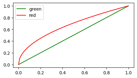
Styling Artists#
Most plotting methods have styling options for the Artists, accessible either when a plotting method is called, or from a “setter” on the Artist.
In the plot below, we set the color of the first line directly when creating it with Axes.plot(), while we set the color of the second line
after its creation with Line2D.set().
fig, ax = plt.subplots(figsize=(5, 2.7))

x = np.linspace(0, 1, 100)
ax.plot(x, x, color="green", label="green")

(line,) = ax.plot(x, np.sqrt(x))
line.set(color="red", label="red")

ax.legend();
Tip
To find out what type of Artist a specific method is generating, head over to the method’s documentation (one of these), like here Axes.plot(), and find out what it Returns (here, a list of Line2D).
Then, you may discover what styling options you have on this Artist, by inspecting the class’ documentation, in particular the set method.
Question
Once you have the line object above, how else can you find out what styling options its set method provides you?
Answer
You may use either line.set? or help(line.set). Try it!
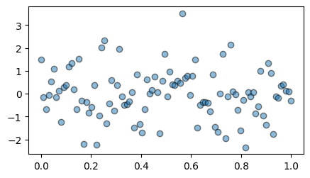
Colors#
Matplotlib has a very flexible array of colors that are accepted for most Artists; see the guide on specifying colors and the list of named colors.
You may also set the opacity of Artists using the alpha argument.
Some Artists will even take multiple colors. For instance, for
a Axes.scatter() plot, the edge of the markers can be different colors
from the interior:
fig, ax = plt.subplots(figsize=(5, 2.7))

data = np.random.randn(100)
ax.scatter(x, data, alpha=0.5, facecolor='C0', edgecolor='k');
Marker and linestyles#
There is an number of markerstyles available as string codes, or you can even define your own MarkerStyle (see the marker reference).
Similarly, stroked lines can have a linestyle. See the linestyle gallery.
Here below we plot the cosine function with a dashed line, and the sine with round markers, and no line:
fig, ax = plt.subplots(figsize=(5, 2.7))
ax.plot(x, np.cos(x), linestyle=':', label='data2')
ax.plot(x[::5], np.sin(x[::5]), marker='x', linestyle='', label='data1')
ax.legend();
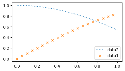
Note
Note how we sliced our two input arrays in the second ax.plot() call in order to plot a subset of points.
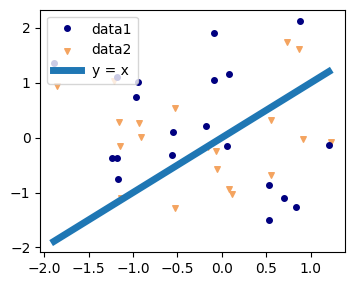
Sizes#
In Matplotlib, most sizes are specified in typographic points (pt). This is the same unit you see in a text editor when selecting a font size. The most notable exception is the size of Figures: figsize specifies the (width, height) in inches. To give you an idea, \(x\) centimeters correspond to \(x / 2.54\) inches, that is, 1 inch is equal to 2.54 cm.
Line widths can be set for Artists that have stroked lines. Marker size depends on the method being used. Axes.plot specifies
markersize in points, and is generally the “diameter” or width of the
marker. Axes.scatter specifies markersize as approximately
proportional to the visual area of the marker.
x = np.random.randn(20)
data1 = np.random.randn(20)
data2 = np.random.randn(20)
line_coords = [np.min(x), np.max(x)]

# Create a figure 10cm wide and 8cm high.
fig, ax = plt.subplots(figsize=(10 / 2.54, 8 / 2.54))
ax.plot(x, data1, "o", color="navy", markersize=4, label="data1")
ax.scatter(x + 0.03, data2, color="sandybrown", marker="v", s=4**2, label="data2")
ax.plot(line_coords, line_coords, linewidth=5, label="y = x")
ax.legend();
Text#
All of the Axes.text() functions return a matplotlib.text.Text
instance. Just as with lines above, you can customize the properties by
passing keyword arguments into the text functions:
t = ax.set_xlabel('my data', fontsize=14, color='red')
And like for any artist, you can see what properties you can set using help on the set method of the returned Artist:
help(t.set)
Help on method set in module matplotlib.artist:

set(*, agg_filter=<UNSET>, alpha=<UNSET>, animated=<UNSET>, antialiased=<UNSET>, backgroundcolor=<UNSET>, bbox=<UNSET>, clip_box=<UNSET>, clip_on=<UNSET>, clip_path=<UNSET>, color=<UNSET>, fontfamily=<UNSET>, fontproperties=<UNSET>, fontsize=<UNSET>, fontstretch=<UNSET>, fontstyle=<UNSET>, fontvariant=<UNSET>, fontweight=<UNSET>, gid=<UNSET>, horizontalalignment=<UNSET>, in_layout=<UNSET>, label=<UNSET>, linespacing=<UNSET>, math_fontfamily=<UNSET>, mouseover=<UNSET>, multialignment=<UNSET>, parse_math=<UNSET>, path_effects=<UNSET>, picker=<UNSET>, position=<UNSET>, rasterized=<UNSET>, rotation=<UNSET>, rotation_mode=<UNSET>, sketch_params=<UNSET>, snap=<UNSET>, text=<UNSET>, transform=<UNSET>, transform_rotates_text=<UNSET>, url=<UNSET>, usetex=<UNSET>, verticalalignment=<UNSET>, visible=<UNSET>, wrap=<UNSET>, x=<UNSET>, y=<UNSET>, zorder=<UNSET>) method of matplotlib.text.Text instance
    Set multiple properties at once.

    Supported properties are

    Properties:
        agg_filter: a filter function, which takes a (m, n, 3) float array and a dpi value, and returns a (m, n, 3) array and two offsets from the bottom left corner of the image
        alpha: scalar or None
        animated: bool
        antialiased: bool
        backgroundcolor: :mpltype:`color`
        bbox: dict with properties for `.patches.FancyBboxPatch`
        clip_box: unknown
        clip_on: unknown
        clip_path: unknown
        color: :mpltype:`color`
        figure: `~matplotlib.figure.Figure`
        fontfamily or fontname: {FONTNAME, 'serif', 'sans-serif', 'cursive', 'fantasy', 'monospace'}
        fontproperties: `.font_manager.FontProperties` or `str` or `pathlib.Path`
        fontsize: float or {'xx-small', 'x-small', 'small', 'medium', 'large', 'x-large', 'xx-large'}
        fontstretch: {a numeric value in range 0-1000, 'ultra-condensed', 'extra-condensed', 'condensed', 'semi-condensed', 'normal', 'semi-expanded', 'expanded', 'extra-expanded', 'ultra-expanded'}
        fontstyle: {'normal', 'italic', 'oblique'}
        fontvariant: {'normal', 'small-caps'}
        fontweight: {a numeric value in range 0-1000, 'ultralight', 'light', 'normal', 'regular', 'book', 'medium', 'roman', 'semibold', 'demibold', 'demi', 'bold', 'heavy', 'extra bold', 'black'}
        gid: str
        horizontalalignment: {'left', 'center', 'right'}
        in_layout: bool
        label: object
        linespacing: float (multiple of font size)
        math_fontfamily: str
        mouseover: bool
        multialignment: {'left', 'right', 'center'}
        parse_math: bool
        path_effects: list of `.AbstractPathEffect`
        picker: None or bool or float or callable
        position: (float, float)
        rasterized: bool
        rotation: float or {'vertical', 'horizontal'}
        rotation_mode: {None, 'default', 'anchor'}
        sketch_params: (scale: float, length: float, randomness: float)
        snap: bool or None
        text: object
        transform: `~matplotlib.transforms.Transform`
        transform_rotates_text: bool
        url: str
        usetex: bool, default: :rc:`text.usetex`
        verticalalignment: {'baseline', 'bottom', 'center', 'center_baseline', 'top'}
        visible: bool
        wrap: bool
        x: float
        y: float
        zorder: float
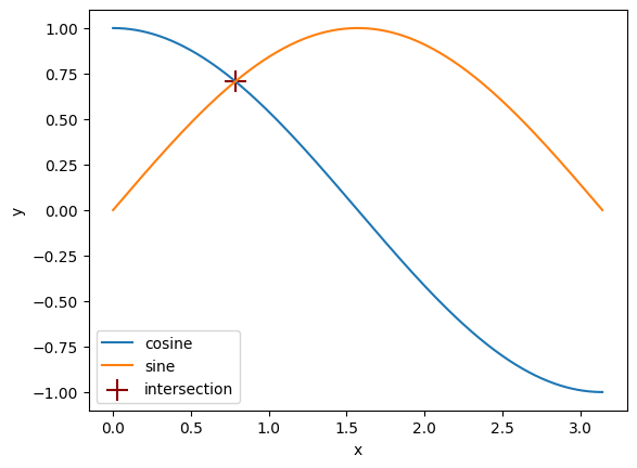
Exercise - cos x sine#
✪✪ Plot the functions np.cos() and np.sin() over the interval \([0, \pi]\), and mark the intersection of the two curves with a big cross. Use a legend to identify all the elements of your plot.
Start by just plotting the two functions, then try to think: what quantity enables you to tell the two curves are close to each other? And which one tells you where they’re as close as ever?
Show code cell source
x = np.linspace(0, np.pi, 1000)
y1 = np.cos(x)
y2 = np.sin(x)

fig, ax = plt.subplots()
ax.plot(x, y1, label="cosine")
ax.plot(x, y2, label="sine")

i_min = np.argmin((y2 - y1) ** 2)
x_cross = x[i_min]
y_cross = (y2[i_min] + y1[i_min]) / 2
ax.scatter(x_cross, y_cross, s=15**2, c="darkred", marker="+", label="intersection")

ax.set_xlabel("x")
ax.set_ylabel("y")

ax.legend();